Look: Subtle Intensity
Posted by Heather | Filed under Blue, Bobbi Brown, Looks, MAC, NARS, Yaby, Yellow
My combinations of yellows and blues aren’t gonna go away anytime soon :-) I just have too many UCLA and Edison MS shirts, and they beg for me to do yellow and blue looks to match! This look, I felt, came out subtle - as in, it’s not in-your-face. But it’s still pretty intense when you look at the makeup. I loves it :-)
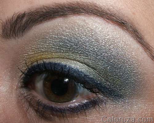
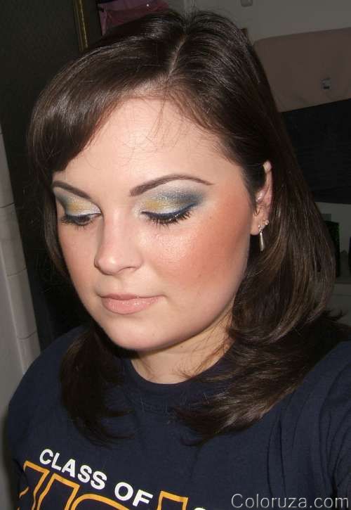
For this look I used:
- Eyes: UDPP (primer), Yaby Pearl Paints (white, lt. yellow, blue), Unbasic White (inner lid), Dreammaker + Chrome Yellow (middle lid), Deep Truth (outer lid), NARS Night Flight (crease), Nylon (highlight), Bobbi Brown Cobalt Ink (liner), Plushlash mascara
- Cheeks: Enough Said BPB + Warmed MSF
- Lips: Creme de Nude + YSL Golden Gloss #1
See more pictures! Read the rest of this entry »
Look: Sorta <3 it…
Posted by Heather | Filed under Blue, Lips, Looks, MAC, Neutral, Pink, Yaby
Meh, not a great look this time. I think I needed liner on the bottom or something… It’s just light, and doesn’t do it for me, but hey, maybe it’s more someone else’s style? :-)
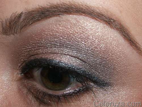
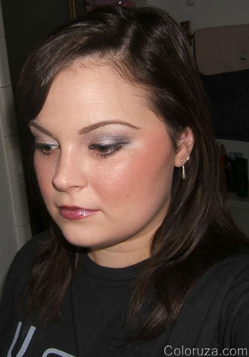
For this look I used:
- Eyes: UDPP (primer), Yaby Lt. Pink (base), Grand Entrance (inner lid), Style Snob (middle lid), Strike a Pose (outer lid & crease), Solar White (highlight), Laura Geller Blueberry baked cake (liner), Plushlash mascara
- Cheeks: X-Rocks
- Lips: Chignon l/s + Snowscene l/g
See more pictures! Read the rest of this entry »
Look: Colors of the Sun
Posted by Heather | Filed under Brown, Looks, MAC, NARS, Orange, Smashbox, Yaby, Yellow
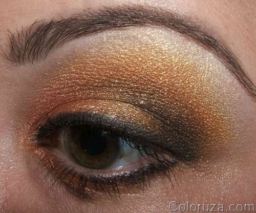
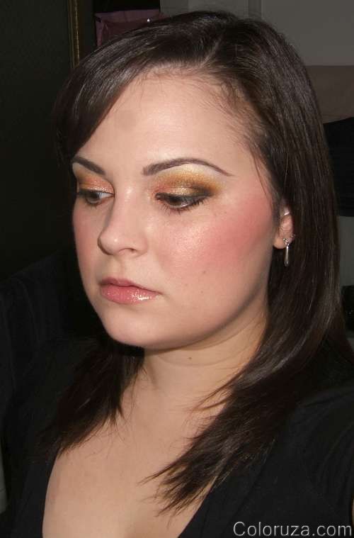
Ok, well they’re not that bright. I don’t know why, but orange eyeshadow totally intrigues me! I’m so fascinated with it, and I am determined to make every color eyeshadow work somehow. Can’t say the same for lip colors unfortunately - bright pinks, severly dark, or bright opaque colors on my lips just looks wrong, and I can’t get over it enough to wear it out. Eyeshadow, on the other hand, usually has me blending anywhere from 4-10 colors together, so I can make any color work (they all play nice together). I really wanted to use some flame-like colors with this look, as well as incorporate my new NARS goodies (Mekong = pure love btw!). You’ll be seeing some more orange-inspired looks soon too. Thoughts?
For this look I used:
- Eyes: UDPP (primer), Yaby Pearl Paints oranges (base), Smashbox Flamingo (inner lid), Smashbox Torch (middle lid), NARS Galapagos (outer lid), NARS Mekong (crease), Smashbox Oyster (highlight), Bobbi Brown Espresso Ink (liner), Plushlash mascara
- Cheeks: Springsheen blush
- Lips: Smashbox Candid lipgloss
See more pictures!! Read the rest of this entry »
Look: Browns
Posted by Heather | Filed under Bronze, Brown, Laura Geller, Looks, MAC, Yaby
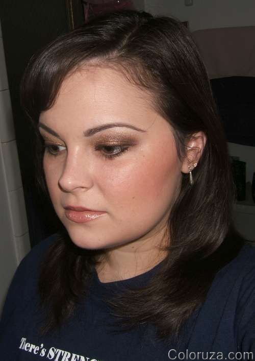
Man, I’m already running out of clever names to title my posts…it’s sad :-/ LOL Oh, and my shirt says “There’s STRENGTH in numbers!” and has lots of numbers on it. I’m a total math nerd, what can I say?! :-)
For this look I used:
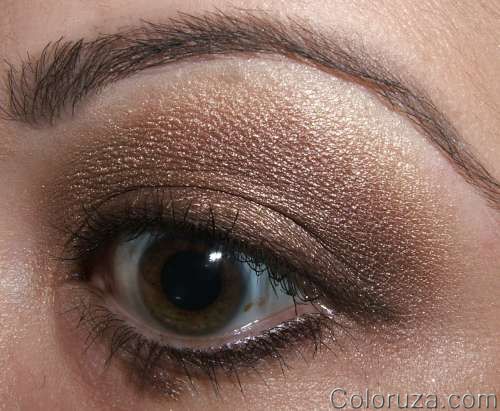
- Eyes: UDPP (primer), Yaby browns, Engaging MES (inner lid), Laura Geller Devil’s Food (middle lid), Buckwheat (outer lid & crease), Creme de Miel (highlight), Laura Geller Dutch Chocolate baked eyeliner, Plushlash mascara
- Cheeks: Eversun BPB
- Lips: Garden Bed lipstick + Summer Crop lipglass
See more pictures! Read the rest of this entry »
Look: Purples with Range
Posted by Heather | Filed under Bobbi Brown, Looks, MAC, Purple, Smokey, Yaby
The colors that I can show the most depth and range with are greens and teals. There are so many good light vs. dark contrasts that I can make on the eye using those colors. Strangely, purple isn’t usually one of those colors that I can make that nice contrast with. And I say strangely, because it should be easy - purple ranges immensely from light to dark, from the reddish to the blueish, etc. So you’d think it would be easy, but not so in my experience. Put this time I feel like I did accomplish a nice fade. It all doesn’t look like one muddied color for once! I’m not sure what I did differently…maybe using the Yaby Pearl Paints as bases worked better for me. Anyway, here’s the look!

For this look I used:
- Eyes: UDPP (primer), Yaby Pearl Paints in purples (base), Crystal (inner lid), Noctournelle (middle lid), Jewel Tone (outer lid), Top Knot (crease), Vellum (highlight), Rave Pearlglide (lower lashline), Bobbi Brown Black Ink (upper liner), Plushlash mascara
- Cheeks: True Romance BPB
- Lips: Guerlain (expensive lipstick with no name lol!) + I can’t remember which gloss…sorry!
See more pictures!! Read the rest of this entry »
Look: Kat Von D Beethoven Gray & Purple
Posted by Heather | Filed under Bobbi Brown, Gray, Kat Von D, Looks, MAC, Purple
Well… this turned out more on the gray side than purple. It just goes to show you that the colors come out differently on your skin than they look in the palette. Not one of my favorite looks, but that’s ok. It’s worth a look I think.
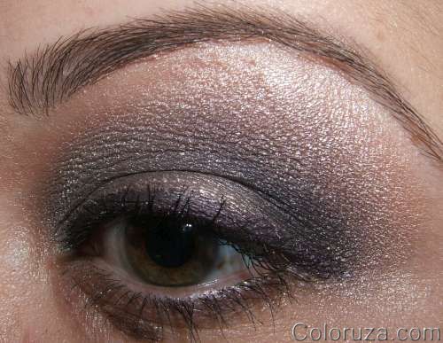
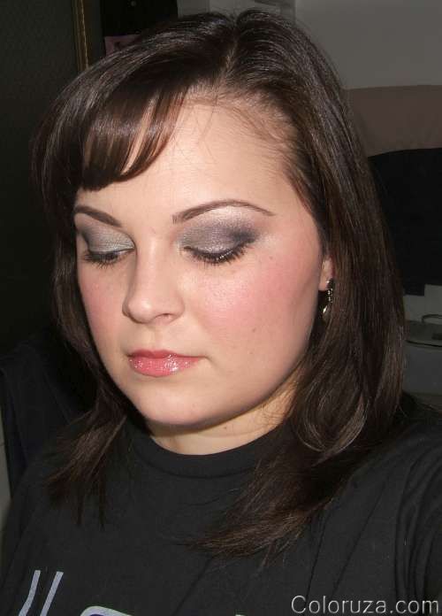
For this look I used:
- Eyes: UDPPS (primer), Greenstroke PP (base), Kat Von D Beethoven Palette, Phloof! (highlight), Bobbi Brown Violet Shimmer Ink (liner), Plushlash mascara
- Cheeks: Tippy BPB
- Lips: Internationalist Dazzleglass
See some more pictures… Read the rest of this entry »
Look: Green Scheme
Posted by Heather | Filed under Green, Guerlain, Kat Von D, Laura Mercier, Looks, MAC, Smokey
That Green Theme look I did is one of my new favorites, so I’ve used it a few times already :-) Just changed up the cheeks and lips a bit. I know it’s lame of me to post the same look so soon, but it pops color, there’s contour and shading, and it’s just everything I’m all about, so I love it. I hope you do too!! I think I may need to do this one as a tutorial!
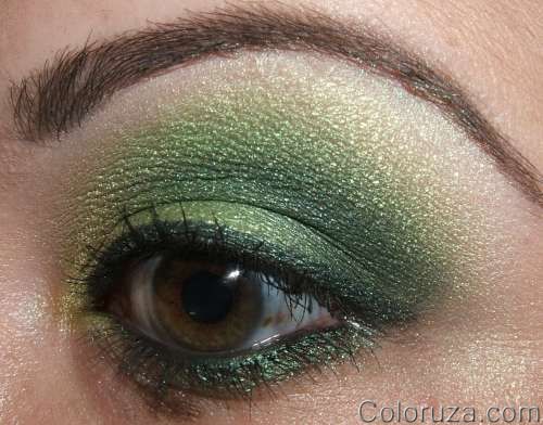
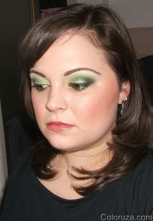
For this look I used:
- Eyes: UDPP (primer), Painterly PP (base), Chartreuse Pigment (inner lid), Kelly Green Pigment (middle lid), Kat Von D Gunner (outer lid & crease), Kat Von D Hawkwind (highlight), Tarnish Kohl (upper lashline), Bankroll Pearlglide (lower lashline), Plushlash mascara
- Cheeks: Fun & Games BPB + Laura Mercier Apricot Shimmer
- Lips: Guerlain Orange Shine lipstick
See some more pictures! Read the rest of this entry »
Look: Sometimes It All Comes Together
Posted by Heather | Filed under Blue, Bobbi Brown, Chanel, Gold, Looks, MAC, NARS, Yaby, Yellow
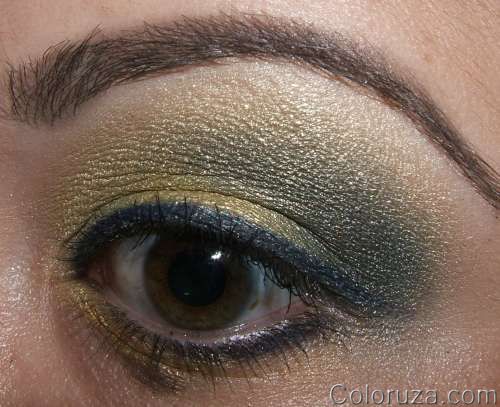
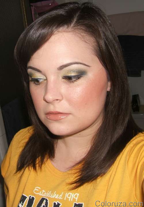
This is one of those looks that I felt really came together the way I wanted. I love the combination of yellows and blues, and I get to do it a lot with all of the UCLA shirts that I have. :-) It almost looks kinda green huh? Go figure haha! ;-P I’m really fond of the way that it all looks with the blush, lipstick and eye look all together. Best part? It’s actually a really easy look to create. Some simple yellows and blues with blue liner. Easy!
For this look I used:
- Eyes: UDPP (primer), Yaby Pearl Paints (light yellow, gold, blue), Soft Force (inner lid & highlight), Bright Future (middle lid), NARS Night Flight (outer lid & crease), Bobbi Brown Cobalt Ink (liner), Plushlash mascara
- Cheeks: Cheek & Cheerful mineralize blush
- Lips: Brave New Bronze l/s + Chanel Bronze Crystal Glossimer
See more pictures! I really love this one!! Read the rest of this entry »
Look: Gold + Teal = Awesome!
Posted by Heather | Filed under Bronze, Gold, Kat Von D, Laura Geller, Looks, MAC, Teal
I finally got back on MUA after being off of it for a good while. Things at work are too busy for me to play :-) But I needed some ideas, and that’s always a great place to go. There’s a FOTD (Face of the Day) board where people post their looks and get responses. A lot of people ask for CC (Constructive Criticism), but I do not. I’m not posting to be criticized…I’m giving back ideas and taking ideas from others. I do value opinions though, and I love hearing yours (afterall, this site is kinda for YOU, right? lol!) in the comments. Lots of people on other boards feel that FOTD board is just for people fishing for compliments, and that’s just not the case. The exchange of ideas is enormous, the validation is inspiring, and the overall positive ways that women are interacting is uplifting. That’s the way I see it, anyway. Have you been to the boards? What’s your opinion?
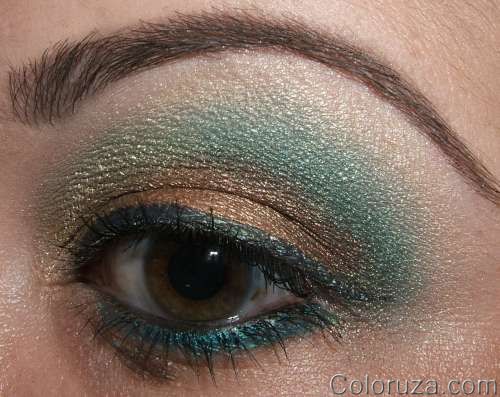
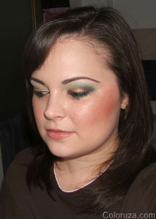
Anyway, on to the look…someone posted a FOTD using the UD Baked palette I believe, and I loved the combination of gold and teal, so I gave it my own spin. At first I didn’t like it at all and was like, uh oh…what have you done?! But with a little bit of a darker color right in the outer crease, it came together, and I really liked how it’s bold, edgy, and different from the everyday, you know? Maybe a little overboard on the blush, and the liner still needs to be thicker more toward the outer edge, but still, I like it (and nobody’s perfect right?) :-)
For this look I used:
- Eyes: UDPP (primer), Painterly PP (base), Metal X Pure Ore (inner lid), Metal X Goldspice (middle lid), Natural Flare MES over those, Teal Pigment (outer lid & crease), Femme Fi (highlight), Kat Von D Proud Peacock (upper lashline), UD 24/7 Flipside (lower lashline), Graphblack Technakohl (waterline), Plushlash mascara
- Cheeks: Laura Geller Sunswept mineralize blush
- Lips: Buoy-o-Buoy l/s + Just a Smudge Suntint balm
See more pictures! Read the rest of this entry »
Look: Kat Von D Gypsy
Posted by Heather | Filed under Bobbi Brown, Gold, Green, Kat Von D, Looks, MAC, Smokey, White
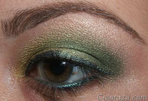
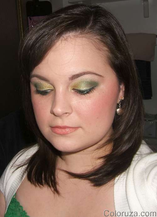
Here’s another look using the Kat Von D eyeshadow palettes: the Gypsy one this time! You know how I love my greens!
For this look I used:
- Eyes: UDPPS (primer), Greenstroke PP (base), Kat Von D Gypsy Palette: Brass Knuckles (inner corner), Birdcage (inner lid), Ego Sum (middle lid), Gunner (outer lid & crease), Femme Fi (highlight), Blooz Kohl (liner), Plushlash mascara
- Cheeks: Bobbi Brown Coral blush
- Lips: Lollipop Lovin’ l/s + Queen Bee lipglass
See more pictures! Read the rest of this entry »

 FOLLOW ME ON TWITTER